Thesis – Dynamic Supplies

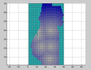
Another photo of my program runnining. I converted my power source definitions so that I can turn them on and off at my leisure. The above distance plot is similar to my previous post (here). The difference is what sources exist. In this one, the sources are (top to bottom left to right) –
- Fairhaven Power Plant
- North East Transmission line from the Central Valley (through Willow Creek)
- Humboldt Bay Power Plant (just under Fairhaven – kind of looks like one big plant)
- Humboldt Redwood Company (formerly PALCO)
- South East Transmission line from the Central Valley (through Bridgeville)
- Southern Transmission line up the 101
I neglected to put in some of the small players in the power supply. Basically any power plant less than 1MW I have left out. While 1MW is still substantial (sometimes as much as 5% of demand), the modeling of the current situation is only to demonstrate the functionality of the model. The goal of the design is to predict outcomes with newer configurations.
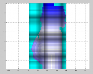
EDIT: Implementing a separate distance calculation for transmission lines was simple enough. Now you can see the lines in image below.

Hi Darrell…thanks for providing the link. I have to admit though to being baffled. I understand (I think!) that your grid is representative of Humboldt Co, with the colors indicative of proximity to nearest power source. Why is this representation important? Who would use this information and how? I’m about as naive about these things as they come, remember…Best, Pete
Hey Pete,
Good questions! Actually the data provided in these plots is not useful to anyone but me. 🙂 Or more accurately, my model. I use distance when figuring out which zone gets power from which source — aiming of course for minimum distance. Part of the idea is leaving T&D out of the model so I do not take substations into account nor phase angle of power, etc. Including that would be far too complex and defeat the purpose (just noting that because it’s the first item many power folks mention). I could just calculate total demand and total supply and place them side-by-side. But I feel it’s much more instructional to see the locations of the sources. Originally, I was going to include a power loss over distance but have instead opted for preference to nearest sources. I will post a couple images of the model running later this week. Thank you for the comments.